Missouri
Wildlife Rescue
Site redesign for tablet & desktop
My Role: UX/UI Designer
Co-researched with: Sunshine Johnson & Antonella Packard
Tools: Figma, Figjam, Google Sheets, Trello
Original Home Page
“It’s hard to tell what the page is supposed to be getting across to me”
— Quote from Round 1 of Interviews
Research
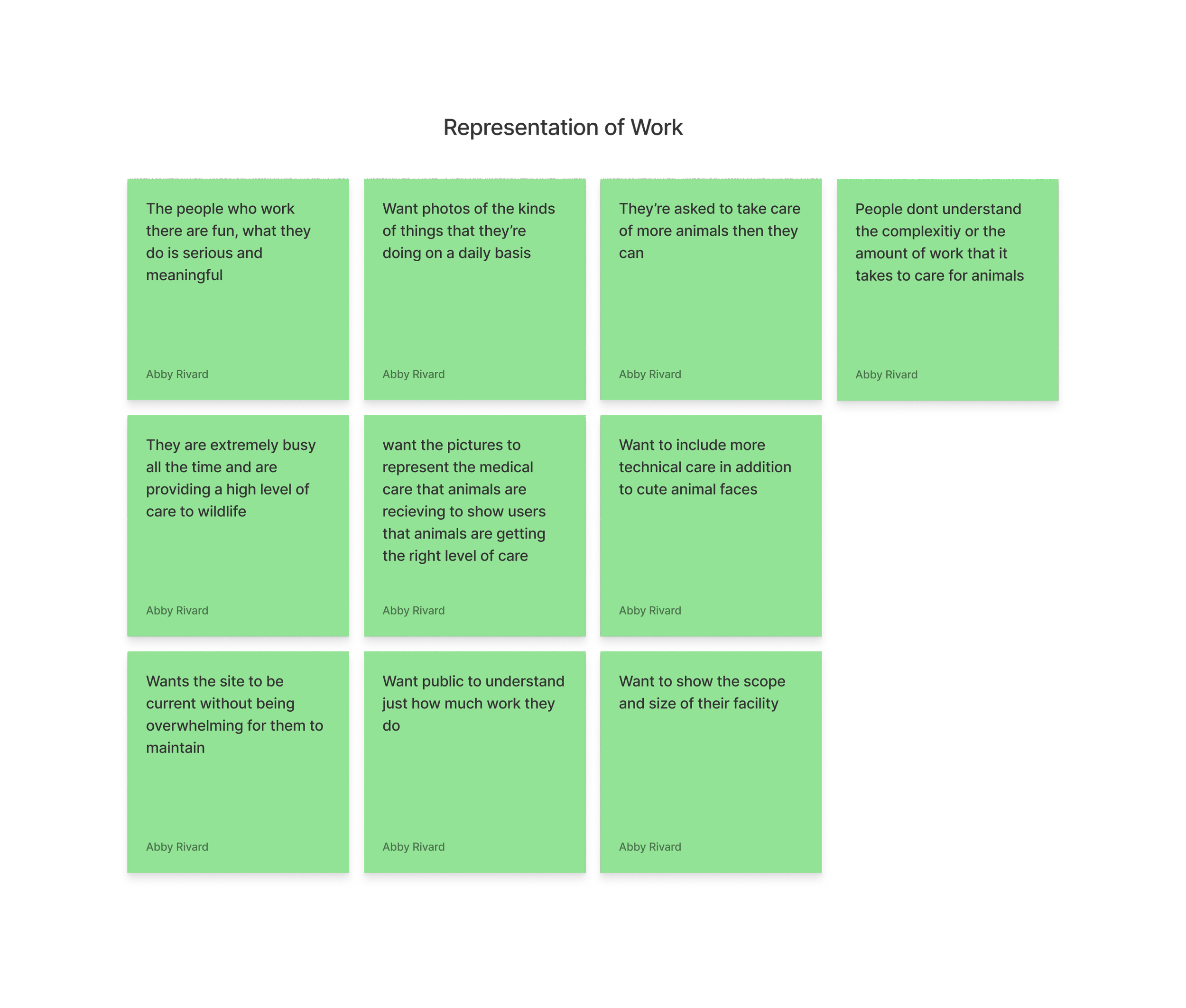
When meeting with the stakeholders we found that they have been wanting to update website for quite some time, but have never had the bandwidth or resources to do so. The stakeholders understand there is a lot of information to sort through on the site, but they want it to be user friendly.
Affinity Diagram
Stakeholder Insight
The site doesn’t have a clear information to help users understand what actions they need to take in a timely manner.
Hypothesis
We believe... creating a more organized and digestible homepage
Will Result in... potential volunteers, interns and individuals who find wildlife to be directed towards how they can help more efficiently
Because... the site will be easier to maneuver when users are trying to act fast (in an emergency for example)
Problem Statement
How might we improve website navigation so that are users are more successful based on their ability to quickly discern which animals need their help and which animals should be left alone.
User Insight
Animal lovers are caring individuals that need more straight forward guidance when dealing with wild animals they encounter because they may not understand which animals need their help and which animals should be left alone.
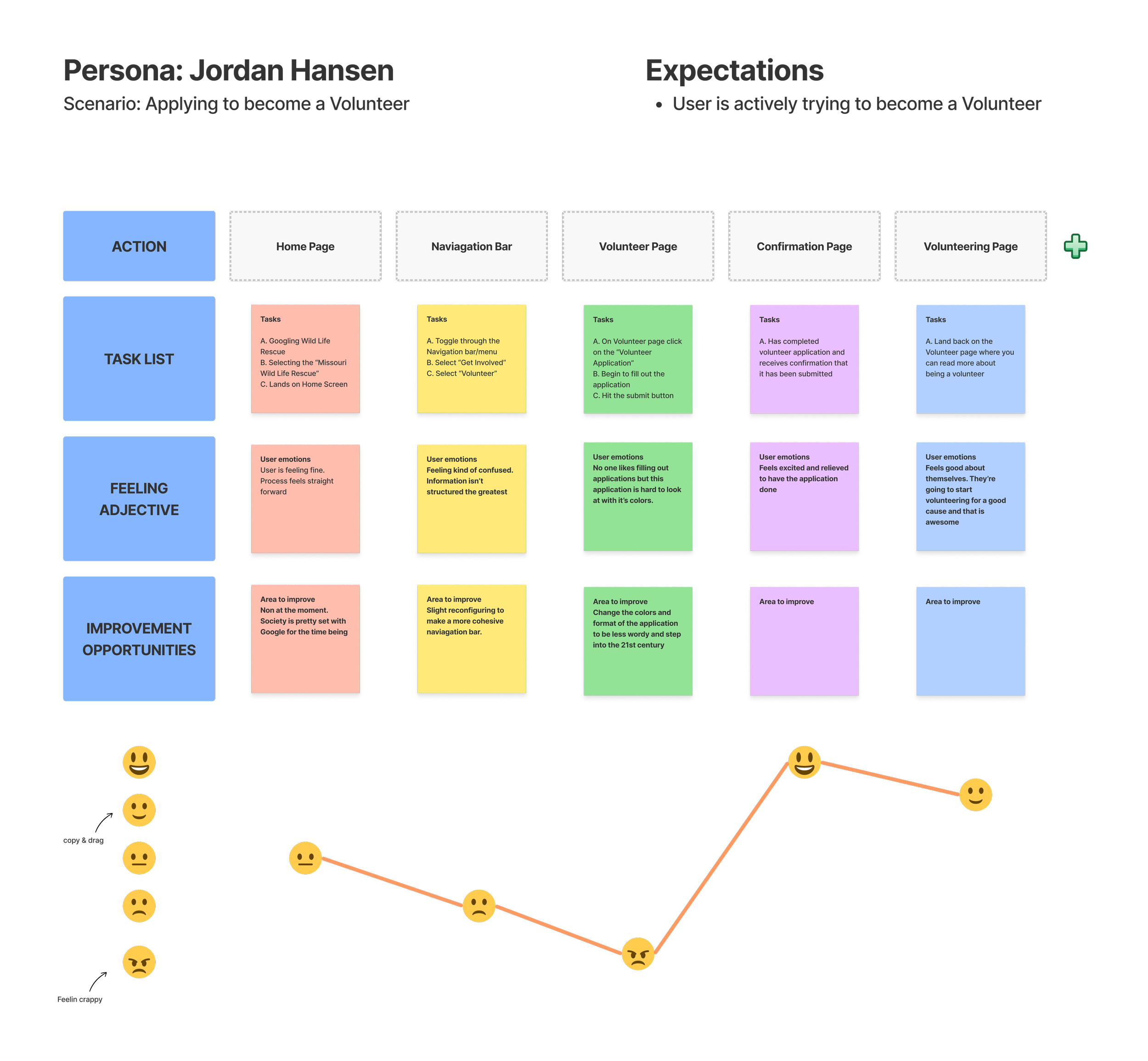
User Journey
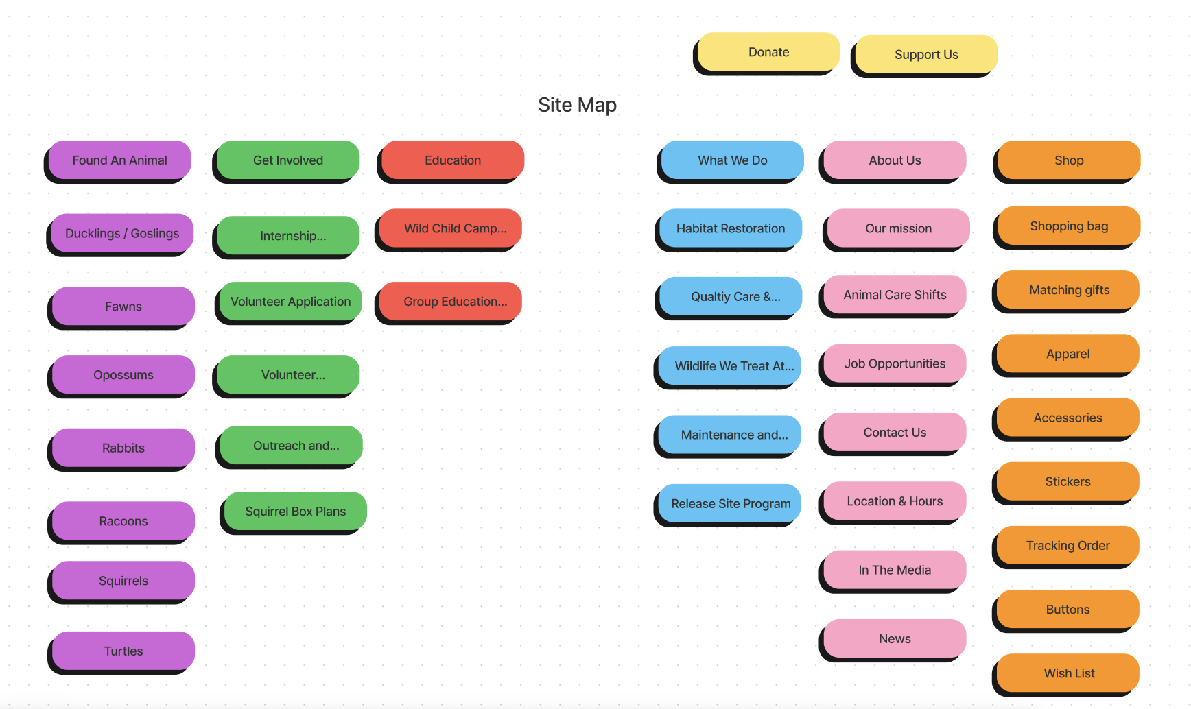
Site Map
Home Page High-Fi Prototype


