Canada Council
for the Arts
Canadian Government concept site redesign
for mobile & desktop
My Role: UX/UI Designer
Tools: Figma, Figjam, Google Sheets, Trello
“Bringing the Arts to Life”
The first thing you notice on the Canada Council for the Arts site is the statement “Bringing the Arts to Life.” This site is meant to celebrate and represent the artists of Canada! The goal with this redesign was to get this site to not just talk the talk with bringing the arts to life, but have it walk the walk.
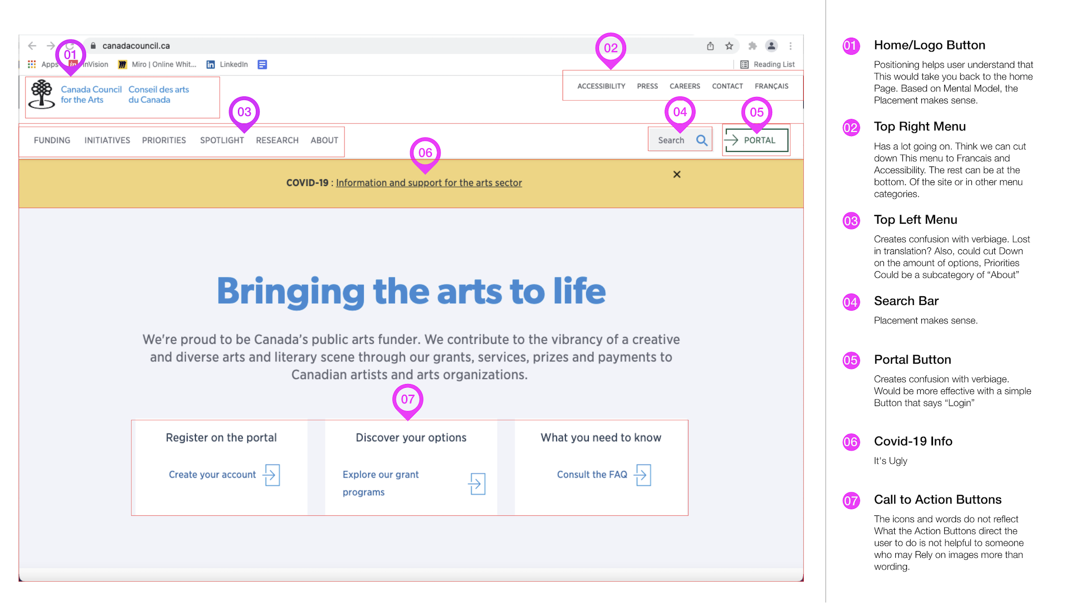
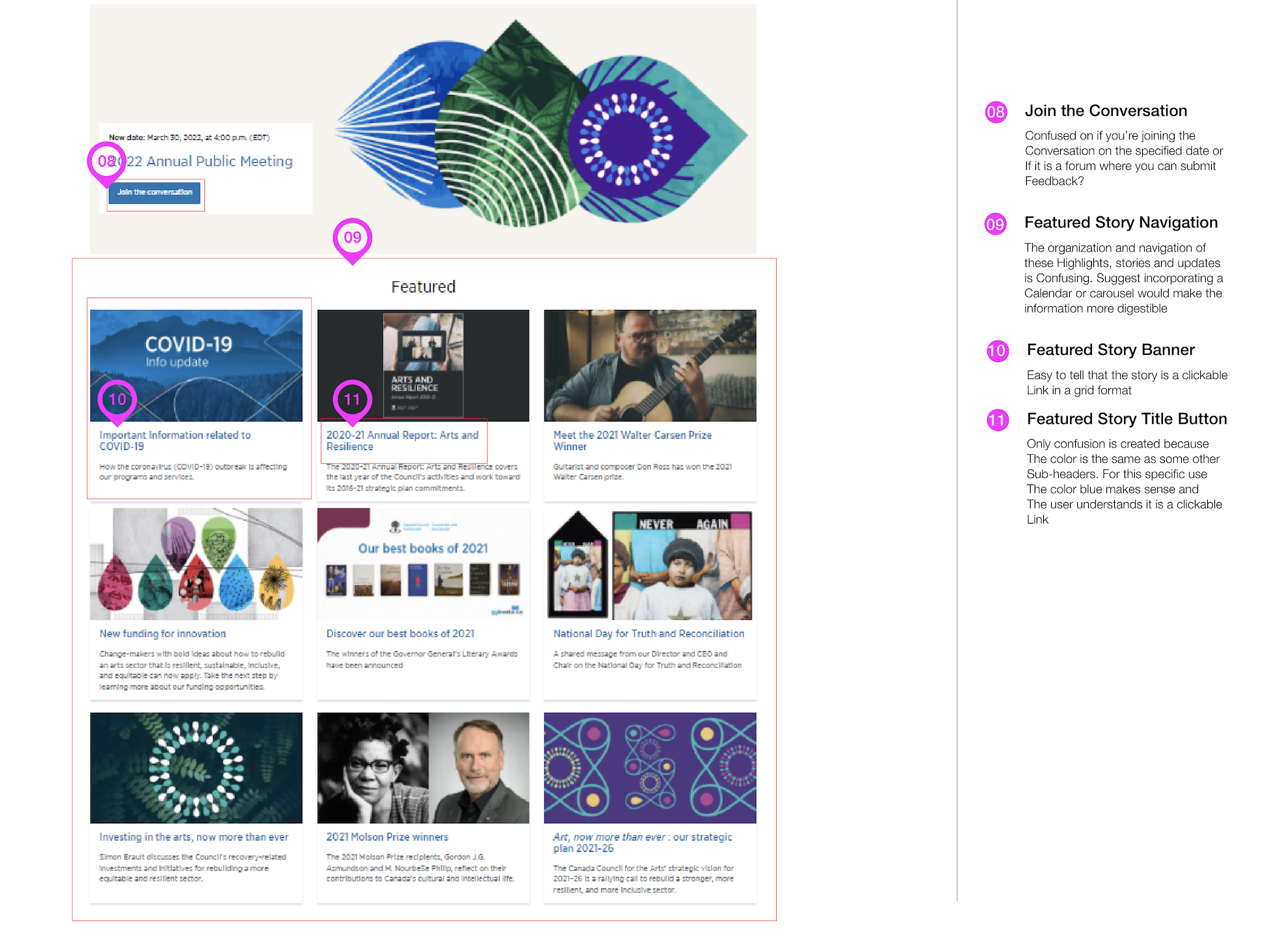
Heuristic Evaluation, Color Accessibility Analysis & Redline Annotation
Site Map & Web Template
A card sort was conducted and site map created based on those results
Creating the web template and site map allowed for the design process to run smoothly. The site map reinforced the idea to simplify and re-word some of the menu options to make it easier for the user to understand.
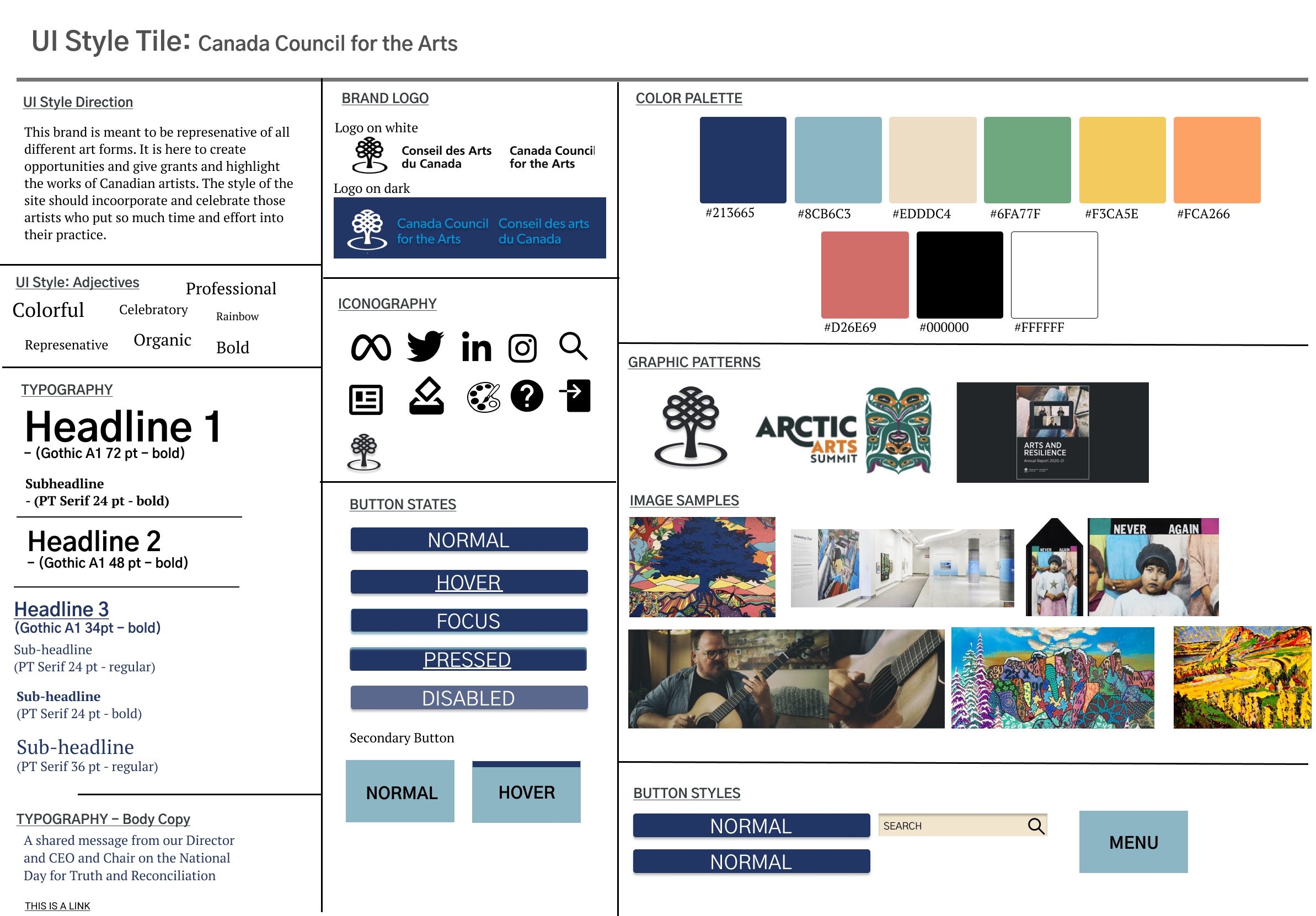
Mood Board & Style Guide
This video is a mood board created to help hone in on the important aspects of this site. Mainly focusing on the artists themselves.


